
The Climate Stripes
A visual warning of changing temperature
Introduction
What are the Climate Stripes?
Climate Stripes, also known as Warming Stripes, is a data visualisation created by Professor Ed Hawkins at the University of Reading in 2018. The graphic shows the change in global temperature from 1850 to the present day using a series of coloured stripes, with each stripe representing one year’s temperature.
The visualisation uses a colour scale from deep blue (representing cooler temperatures) through white to deep red (representing warmer temperatures). The stark transition from predominantly blue to predominantly red stripes clearly shows the dramatic warming of our planet over the past century.
About Professor Ed Hawkins
Ed Hawkins is a climate scientist at the National Centre for Atmospheric Science and the University of Reading. He created the Climate Stripes as part of his work to communicate climate science more effectively to the public. The visualisation was launched on World Meteorological Day in 2019.
“The beauty of the warming stripes is that they can start conversations about climate change wherever they are displayed.”
Ed Hawkins
Key Facts
Created: 2018
Creator: Prof. Ed Hawkins
Institution: University of Reading
Date Range: 1850-present
Global Impact: Used in 100+ countries
Usage
The Climate Stripes have been displayed on:
- Weather forecasts
- Electric vehicles
- Public buildings
- Fashion items
- Scientific publications
Awards
Royal Society’s Kavli Medal and Lecture
Ed Hawkins, the creator of the climate stripes, won this award in 2018.
Royal Meteorological Society’s Climate Science Communication Prize
Hawkins won this award in 2017 for his animated spiral graphic that tracked temperatures from 1850 to 2016.
Why the Climate Stripes matter
The Climate Stripes have become one of the most compelling and widely shared images of climate change for several reasons:
- Simplicity: The visualisation strips away all unnecessary elements, making the message clear and unmistakable.
- Accessibility: Regardless of language or scientific background, the graphic is easy to understand.
- Versatility: It is possible to adapt the stripes for different regions and contexts, showing local climate impacts.
- Impact: Helping with climate communication, the stripes have been featured on news broadcasts, weather reports, and even clothing.
The data
Scientific data and methodology
The data behind the Climate Stripes comes from multiple scientific sources, including NASA, NOAA, and the UK Met Office.
| Time Period | Data Source | Methodology |
|---|---|---|
| 1850-1900 | HadCRUT4 dataset | Land-based stations, ship observations |
| 1901-1950 | CRUTEM4 dataset | Expanded network of weather stations |
| 1951-present | Multiple datasets (GISTEMP, ERA5) | Weather stations, satellites, ocean buoys |
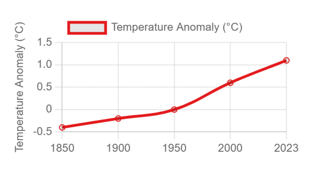
Global temperature anomalies
The visualisation shows that global temperatures have risen by approximately 1.1°C since pre-industrial times, with most of this warming occurring in the past 50 years.
Key scientific findings
The data reveals several critical findings:
- The observed changes far exceed natural variability
- The rate of warming has accelerated significantly since the 1970s
- The last seven years have been the warmest on record
- The warming trend is consistent across different measurement methodologies
Climate Stripes graphic Professor Ed Hawkins (University of Reading)